A recent Washington Post article discussed the relative challenges that poorer Americans face in earning financial success and wealth compared to their richer peers.
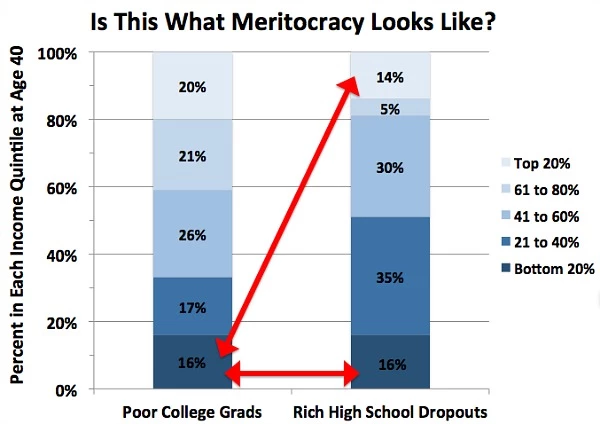
One of the most prominent pieces of evidence presented was an graph comparing the distribution of income for two cohorts: rich individuals who dropped out of high school and poorer individuals who graduated from college.

In discussing the graph, the article states that "Specifically, rich high school dropouts remain in the top about as much as poor college grads stay stuck in the bottom — 14 versus 16 percent, respectively. Not only that, but these low-income strivers are just as likely to end up in the bottom as these wealthy ne'er-do-wells. Some meritocracy."
My purpose here isn't to discuss the merits of their overall claim nor to challenge the idea that growing up in poverty makes one's path to financial success much more difficult. However, I would like to question this article's specific interpretation of the data presented in the referenced graph.
First, the graph itself is somewhat confusing, so it's worth ensuring that we understand the data that it's presenting. The two columns represent the distribution of each cohort in different income bins (those bins represent quantiles, but that's not extremely important to the structure of the graph). So, for example, of the people who fall into the "Poor College Grads" category, 20% fall into the richest quantile and 16% fall into the poorest quantile, and for those who fall into the "Rich High School Dropout" category, 14% fall into the richest quantile and 16% fall into the poorest quantile.
The article's main takeaway from this graph is that:
- Both cohorts have 16% of people falling into the poorest quantile
- The percentage of the "Poor College Grads" group that falls into the poorest quantile is only slightly less than the percentage of "Rich High School Dropouts" who fall into the richest quantile
While these observations are certainly true, they seem to miss the overall trend presented in the graph. The graph instead shows that the "Poor College Grads", compared to the "Rich High School Dropouts", are much more likely to be in the top 2 quantiles (41% vs 19%) and much less likely to be in the bottom two quantiles (33% vs 51%).
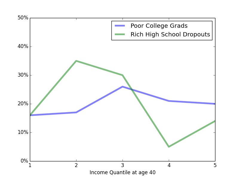
I think a better visualization of the data makes this trend more evident. Turning the data into a simple bar graph creates a more clear visualization of the distribution of these two cohorts

From that image, it's clear that if one were given the choice of drawing a quantile randomly from one of the two distributions, one would much prefer to draw from the "Poor College Grads" distributions. The fact that the two lines converge on the left and the fact that the height of the green line on the far right is not too much lower than the height of the blue line on the far left (which the article emphasizes using arrows) seems to be less important than the larger differences throughout most of the distributions.
A much better way to demonstrate differences in the eventual wealth of these two cohorts would be to compare the quantile distributions of rich vs poor high school dropouts and rich vs poor college graduates. My intuition is that comparison would be easier to interpret and, being an apples-to-apples comparison, any differences between the two distributions would be more significant.
In general, this image is a case of making simple data more complicated than it needs to be, and that additional complexity has the effect of potentially obscuring the underlying data. If possible, data should be represented by a line graph, a bar graph, or a table. Only under rare circumstances should one deviate from that policy, and only if one really knows what they are doing.