The recent tragedy in Arizona has sparked a lot of controversy. Many people from all sides are trying to understand how or why such a thing could take place and how it could be prevented in the future. This post isn’t going to be about assigning blame, nor is it going to be about the futility of applying logic and reason to the workings of a madman. Rather, it’s going to be about the presentation of data and statistics.
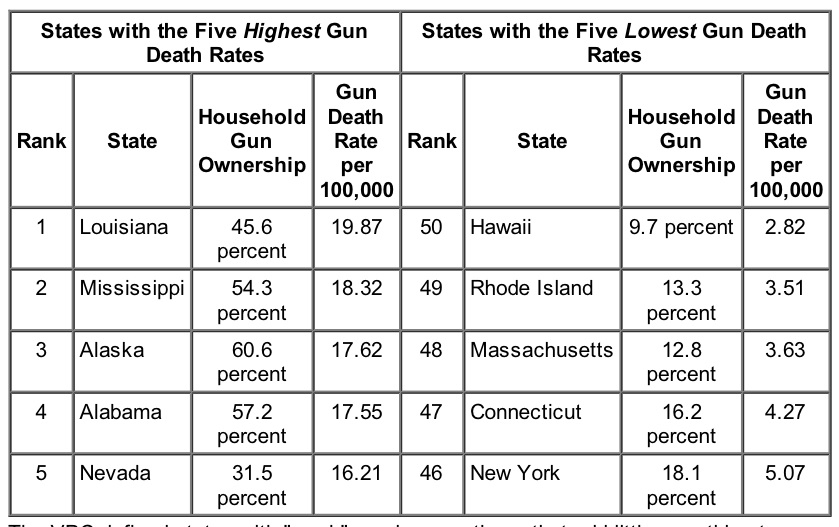
One argument related to Arizona’s shooting that I came across focused on the relationship between the number of guns in a state and that state’s propensity toward gun violence. I saw in several places an image which attempted to concisely summarized this point:
This graphic stood out to me for several reasons. First, the data being quoted superficially seems to be quite convincing: the states with the highest rates of gun-related deaths do have much higher percentages of people who own guns. While from that data alone it remains unclear how the underlying relation worked, or in which direction the underlying causation pointed, this data seems to be direct evidence against the idea that higher gun ownership actually reduces gun homicides via the phenomenon of people in a crowd “fighting back.”
However, I was particularly interested in this graphic for other reasons. Clearly a lot of the data is missing. Only 10 states are shown, which of course represents only 20% of the available data (the rest being the other states, of course). So, this graphic is really only including the endpoints, which may or may not be outliers. One should never try to determine a trend by considering only the extremes. Does this relationship hold among the other 40 states? If so, it would certainly make this graphic more powerful? And if not, then the image is being disingenuous by hiding information that certainly was available. At some point, somebody made a conscious decision to hide the majority of the data, a decision that should certainly be questioned.
In addition, the graphic doesn’t actually tell what the death rates are, it simply orders them and gives the relevant rate of gun ownership. It could be, for example, that LA has twice as many deaths as AK and five times as many as NY. Or, it could be that the rate is nearly constant among all 50 states, in which case the ordering of the states would come from minor fluctuations. One has no idea based on this image.
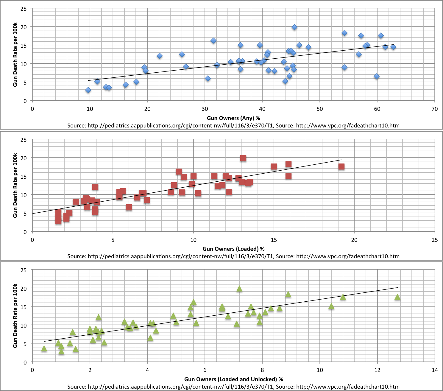
So, what’s my point? I’m not trying to beat up on this one particular image and to feel superior as a result. Instead, I’m making a broader point: that our society is generally bad at reading and interpreting graphs and charts, and it is just as bad at making them. As it stands, this chart is almost meaningless. It would be obviously unacceptable if presented to a group of academics, and yet it has become somewhat viral among the general public. This is somewhat frustrating to me, mostly because of how easy it would be to make a much more effective and accurate image. To prove my point, I attempted to do just that.
So, to do a better job, I first had to get my hands on the underlying dataset from which this chart was made. This turned out to be a bit more challenging than I had anticipated. The image itself listed its source as “Violence Policy Center, 2010 (From 2007 CDC Data).” While I was pleased that the source material was named, there was no link to an actual paper, study, or website containing the raw data in the image, nor was there any such link in any site that hosted the link that I could find. So, I was forced to google.
Google search: violence policy center 2007 cdc data
This led me to a site that linked me to something in the right direction:
http://pajamasmedia.com/blog/debunking-a-pro-gun-control-study-using-their-own-stats/
This site contained a link to a press release from the Violence Policy Center that contained the data used in the graphic:
http://www.vpc.org/press/1006gundeath.htm
So, it became clear why the graphic only included a few of the states: whoever made it only looked as far as this press release when making the image. However, when doing so, they neglected to include the rates themselves and instead only used the ordering. That level of laziness or simplification or both made me somewhat skeptical and made me want to dig deeper.
The press release contained a link to the “data” for all 50 states:
http://www.vpc.org/fadeathchart10.htm
but this turned out really to only be half of the data. It only contained the “State Firearm Death Rates” for the states, but not their percentage of gun ownership. To find that, I would still need to locate an underlying academic paper. The title of that paper was listed in the press release described above and was found with a google search of the title and date:
Google search: Prevalence of Household Firearms and Firearm-Storage Practices in the 50 States and the District of Columbia: Findings From the Behavioral Risk Factor Surveillance System, 2002
This actually turned up the paper itself, which was in a publication called “Pediatrics: The Official Journal of The American Academy of Pediatrics.” It was a bit unclear why pediatrics would have a paper about gun violence, but that’s a bit of an aside.
[Prevelance of Household Firearms...](http://pediatrics.aappublications.org/cgi/content/full/116/3/e370?maxtoshow=&HITS=10&hits=10&RESULTFORMAT=&fulltext=Gun+Storage+and+Children&searchid=1126214241140_16213&stored_search=&FIRSTINDEX=0&sortspec=relevance&journalcode=pediatrics http://pediatrics.aappublications.org/cgi/content/full/116/3/e370?maxtoshow=&HITS=10&hits=10&RESULTFORMAT=&fulltext=Gun+Storage+and+Children&searchid=1126214241140_16213&stored_search=&FIRSTINDEX=0&sortspec=relevance&journalcode=pediatrics)
This actually contained a link with the raw data about gun ownership rate:
http://pediatrics.aappublications.org/cgi/content-nw/full/116/3/e370/T1
So, using this and the state gun violence rates that I found before, I could go about reproducing the information contained in the graphic and could attempt to go further.
Thinking only from the perspective of data-presentation, these quickly-thrown-together plots are much more effective at making the desired point. When comparing gun-violence rates to the percentage of people in a state who own any gun, one can infer an approximately linear relation (with a decent amount of noise). However, when one requires that the guns be loaded or loaded AND unlocked, the trend becomes more discernible. In nearly the same area, one can include much more information, and more relevant information. The underlying argument depends on the existence of a trend, and only by displaying the entirety of the data in a simple yet proper way does that trend become clear.

